
Folio N° 14 / Institutional Archive
Kinntor
Moo Kinn Packaging Design
Embellishment and Branding
Embellishment and Branding
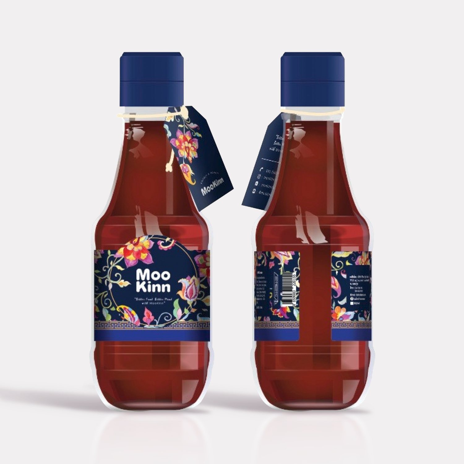
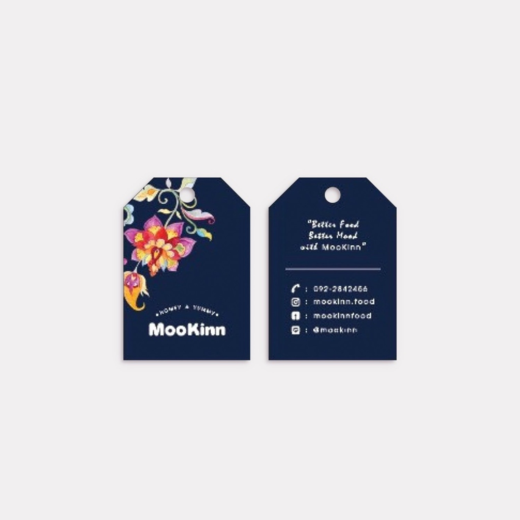
The branding strategy focuses on creating a premium, trustworthy identity through a consistent visual language across various packaging formats (pouches, bottles, and hangtags).
Logotype: The brand uses a bold, rounded sans-serif font for "MooKinn," which feels approachable and contemporary. It is often accompanied by the tagline, "Better Food Better Mood with MooKinn," reinforcing a lifestyle-oriented value proposition.
Color Palette: The brand utilizes two primary color schemes
Deep Midnight Blue: Used for a more elegant, "premium" feel, often seen on the bottle labels and hangtags.
Vibrant Crimson Red: Used on the stand-up pouches, likely to stimulate appetite and signify bold flavor profiles.
Finishing Touches: The use of intricate floral patterns serves as a primary embellishment. These illustrations feature a "Lai Thai" or "Kranok" influence but with a colorful, watercolor-style execution. Gold-toned Greek key/fret borders are used to separate the patterned sections from the solid brand blocks, adding a touch of classical elegance.
Informational Layout: The branding remains functional, with clear iconography for social media handles (Instagram, Facebook, Line) and QR codes for easy consumer engagement.
Design Concept
The core design concept of MooKinn is "Modern Heritage." It aims to bridge the gap between traditional Thai recipes and the needs of the modern, urban consumer.
Cultural Fusion: The pattern work is a nod to Thai art and textiles, suggesting that the product inside (likely a sauce or a prepared food base) is rooted in authentic, long-standing tradition. By applying these traditional motifs to modern packaging like spout pouches and sleek bottles, the brand signals "convenient authenticity."
The "Floral Bloom" Motif: The central floral elements symbolize freshness and the natural quality of the ingredients. The vibrant, multi-colored petals against a dark background create a high-contrast, eye-catching effect that stands out on a retail shelf.
Clarity and Trust: The back-of-pack design is clean and organized, featuring a clear ingredients list, barcode, and "Clean & Safe" icons. This minimalist approach to data-heavy areas balances the busy, decorative nature of the front, ensuring the brand appears professional and transparent.
Versatility: The design is modular; it works equally well as a large-scale print on a pouch or a delicate detail on a bottle hangtag, maintaining brand recognition regardless of the product size or shape.
More from the Archive
A curated selection of private commissions and bespoke editions
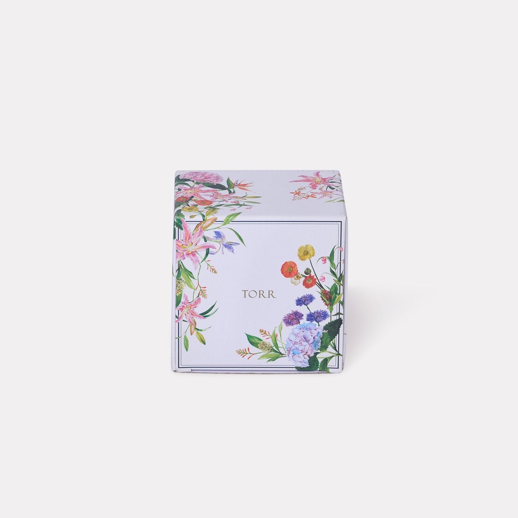 Torr Floral Mug's Box
Torr
 Central Cenfinity Shopping Bag (Navy Edition)
Central
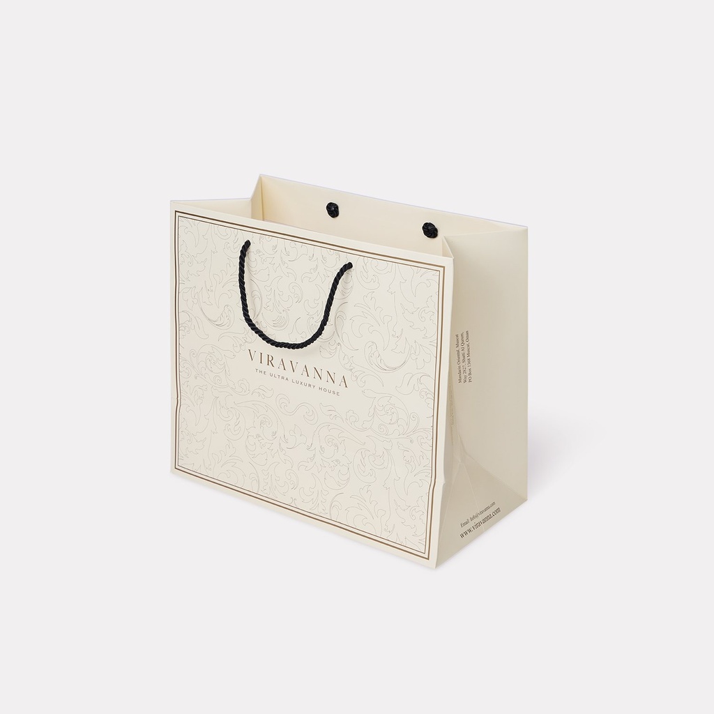 Viravanna Shopping Bag
Viravanna
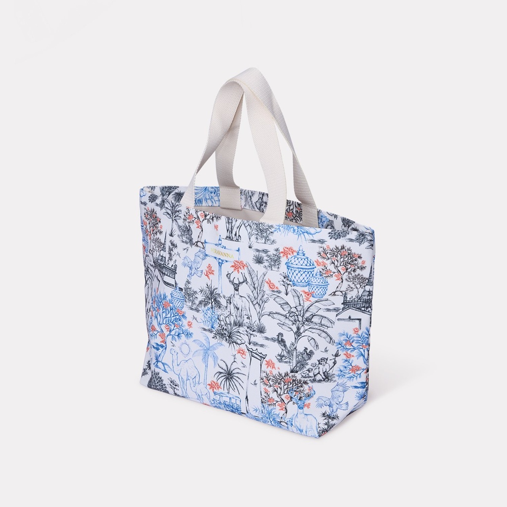 Viravanna Canvas Bag
Viravanna