
Folio N° 06 / Autumn Archive
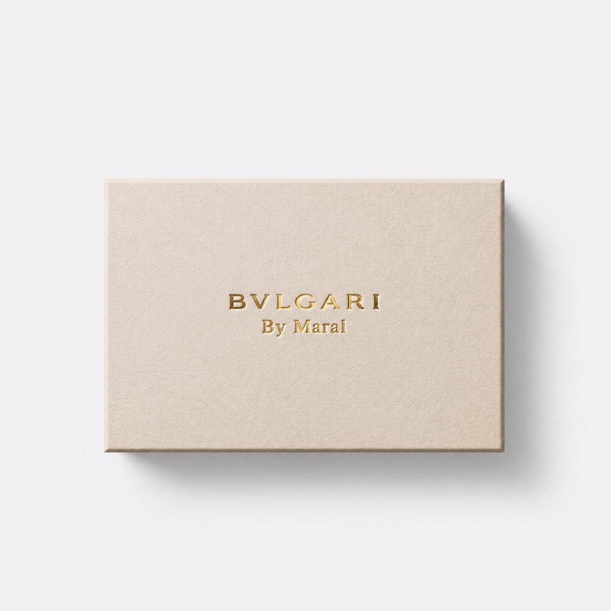
BVLGARI By Maral
BVLGARI Jewelry Box
Embellishment and Branding
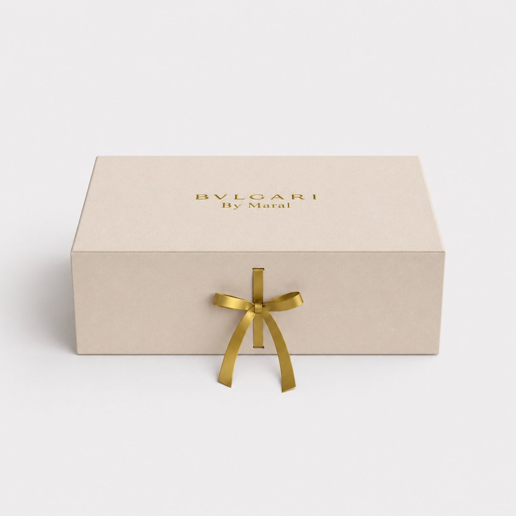
The branding is characterized by minimalist elegance. The central focus is the "BVLGARI By Maral" logo, rendered in a luxurious gold foil that provides a sharp, metallic contrast against the matte beige surface.
Typography: The primary brand name uses the iconic, bold serif typeface associated with Bvlgari, while "By Maral" is presented in a smaller, delicate serif font to establish a secondary hierarchy.
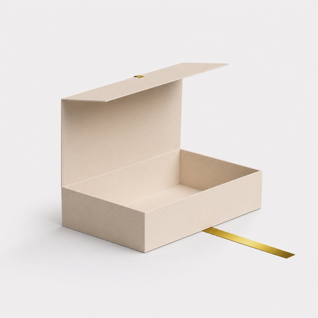
Hardware & Details: The box features a functional gold ribbon pull or strap, which serves both as a decorative accent and a tactile opening mechanism. This gold element mirrors the logo's finish, creating a cohesive visual thread throughout the unboxing experience.
Design Concept
The core concept of this packaging is "Modern Heritage." It strips away unnecessary patterns to focus on the quality of the materials and the prestige of the name.
Structure: The box utilizes a clamshell or magnetic-flap architecture, which is a hallmark of high-end jewelry and perfume packaging. This structural choice ensures a sturdy feel and a satisfying "snap" or smooth movement when opened.
Color Palette: The choice of muted champagne/beige evokes a sense of warmth, neutrality, and timelessness. It positions the product as sophisticated rather than trendy, aiming for a "quiet luxury" aesthetic.
User Experience: The design emphasizes the ritual of unboxing. The use of the gold ribbon indicates a curated, gift-like experience, suggesting that the contents within are precious and handled with care.
More from the Archive
A curated selection of private commissions and bespoke editions
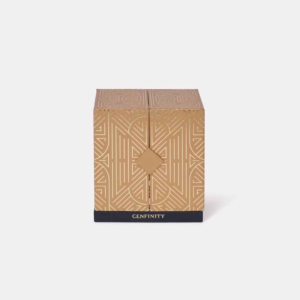 Central Cenfinity Mooncake Box 2024
Central
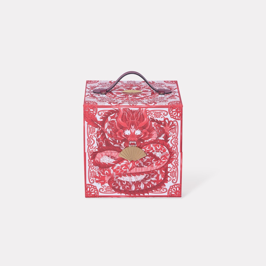 The Oriental Classic Mooncake Box 2024
Mandarin Oriental Bangkok
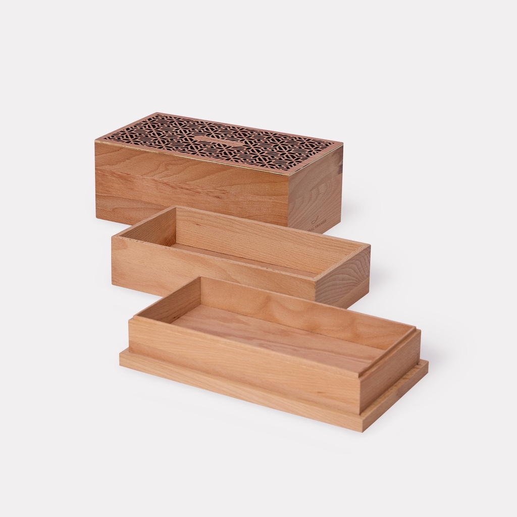 Central Cenfinity Mooncake Box 2025
Central
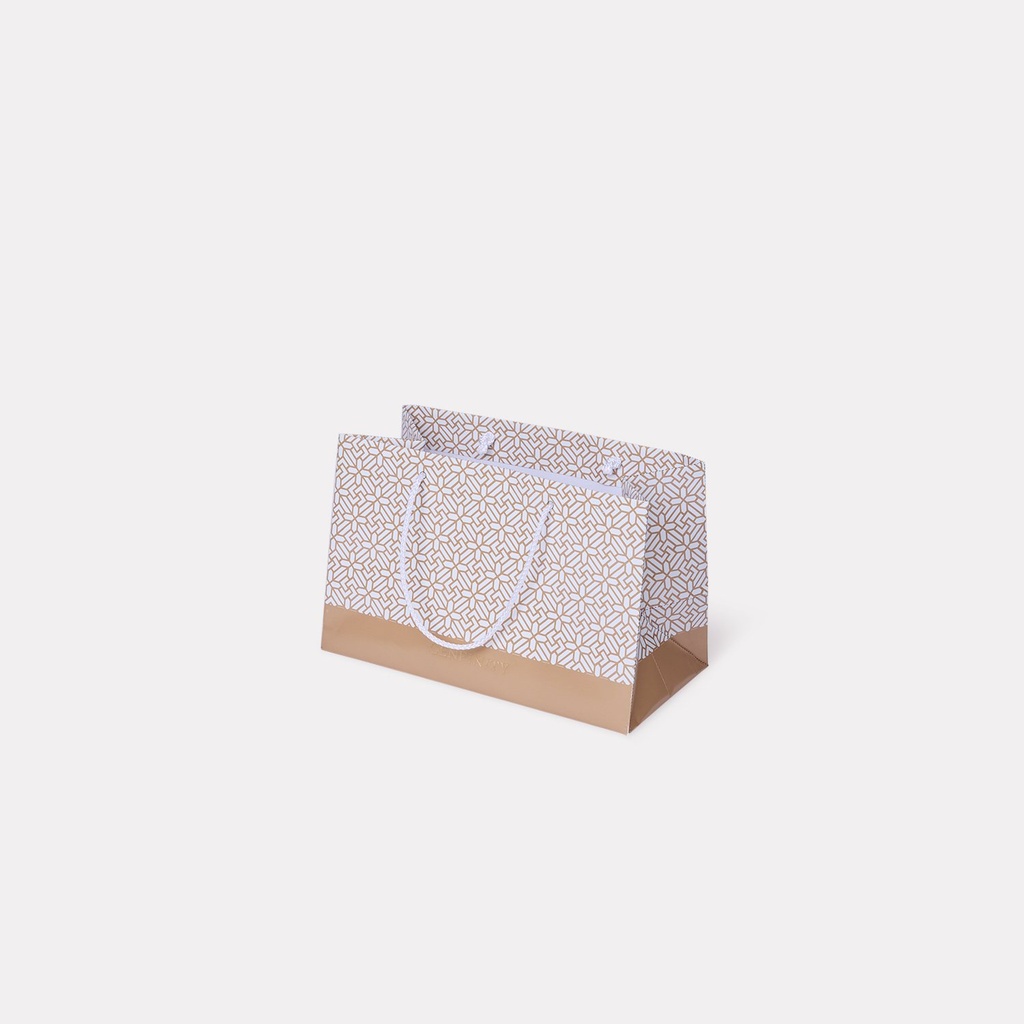 Central Cenfinity Shopping Bag of Mooncake Box
Central